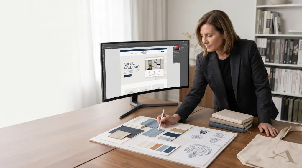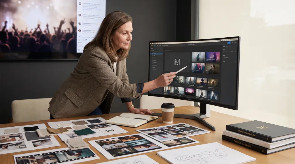

Staring at your homepage, the first thing a visitor sees is the branding hero . See our portfolio →
Branding Hero: How Modern Startups Design Impactful First Impressions That Actually Convert
Staring at your homepage, the first thing a visitor sees is the branding hero. Most founders underestimate how much rides on this one section, it’s far more than a decorative banner. The branding hero determines if a visitor believes you or bounces. Within three seconds, a weak hero can destroy trust, tank conversion rates, and broadcast that your startup doesn’t understand its market. High-growth teams treat the hero as a conversion engine, not a design afterthought. In 2026, with digital competition fiercer than ever, your hero section is the most leveraged real estate on your site.
What Is a Branding Hero and Why It Directs First Impressions
The branding hero is the primary section at the top of your website, often above the fold, spanning the width of the screen, and typically the first thing every visitor sees. For SaaS and fintech startups, it’s usually a bold visual, a crisp value proposition, and a decisive call-to-action. But its real job is deeper: to anchor trust and signal credibility in seconds. When visitors land, they’re asking, “Is this for me? Can I trust this?” The branding hero frames your entire brand narrative and sets expectations for your solution’s quality and relevance.

Startups launching in 2026 are under immense pressure to deliver clarity instantly. A hero with a vague tagline or generic stock image erodes trust, even if your product is top-tier. Modern launches in SaaS often lead with a hero that combines a technical visual (sometimes 3D or interactive) alongside a razor-sharp promise: “Automate your compliance in 48 hours,” not “We make business better.” Specificity and clarity carry more weight than cleverness or visual polish alone.
Too many founders try to say everything at once. The result is a diluted message, a muddled first impression, and lost conversions. Top-performing brands focus their hero on a single, specific anxiety. For example, a fintech startup might use, “Launch embedded payments in days, not months,” paired with a visual of their API in action.
- First impressions anchor trust: The hero is where snap judgments happen. You have seconds to earn belief or lose the visitor.
- Specificity signals expertise: Vague claims signal amateurism and a lack of market insight.
- Technical visuals can impress, or distract: Used well, they say “we get it.” Used poorly, they say “we’re compensating.”
Leading startups in 2026 are using data-backed approaches for their branding hero. They examine heatmaps, scroll depth, and even eye-tracking to ensure the most critical message and CTA are seen immediately, no guessing, no wasted pixels.
Pro tip: Review your hero section with a first-time visitor. Can they describe your product’s value and audience in less than a sentence? If not, your hero needs a rewrite, not a redesign.
Related decision: See Branding And Sponsorship strategies for startups for deeper context on trust signals and launch tactics.
Designing a Branding Hero That Solves for Clarity, Not Ego
Building a branding hero isn’t about satisfying every stakeholder’s preference or showcasing the designer’s favorite animation trick. The only thing that matters is whether your hero answers the visitor’s top question in three seconds. That question is rarely, “Is this design cool?”—it’s “Does this solve my problem?” and “Is it for someone like me?”
The most common founder mistake is letting the hero become a compromise between internal opinions rather than a laser-focused market signal. This happens when founders demand clever taglines, investors want to see innovation, and marketers push for SEO keywords. The result? An incoherent, forgettable first impression that fails to compel action.
High-growth teams approach the branding hero as a scientific experiment, not an art project. They use frameworks and user research to clarify:
- What’s the #1 anxiety visitors have? Is it trust in your tech, speed of deployment, or risk of switching?
- What can we promise that resolves it, credibly and fast? Is your value prop believable at a glance?
- What evidence (visual or textual) backs the promise? Do you show the actual UI, a customer testimonial, or a quantifiable result?
For example: A SaaS brand targeting compliance managers might focus their hero on “Automate SOC 2 audits with zero engineering lift.” The visual isn’t a generic dashboard, it’s a real snippet from their workflow, reinforcing authenticity. Every pixel and word supports the main promise. This approach isn’t just theory: MDX clients who focused on hero messaging saw 30, 50% higher demo signups than those who prioritized visual polish alone.
Operationally, aligning on the branding hero means:
- Running short user interviews with your ICP before launch.
- Testing 2, 3 hero variations via A/B or multivariate tools.
- Setting clear internal decision criteria: “Does this hero resolve the #1 customer anxiety?”
- Reviewing analytics post-launch and iterating quickly if bounce rates remain high.
Resist the urge to let stakeholder egos dilute the message. A hero that tries to say everything says nothing. The fastest-growing SaaS and fintech teams in 2026 are ruthless about clarity above all else.
Related posts: Dive deeper into SaaS Branding Agency selection criteria to see how the right partner can sharpen your messaging and avoid costly missteps.
Technical Execution: Animation, Performance, and the Cost of Overreach
It’s tempting to equate a “modern” branding hero with more animation, more interactivity, and more visual spectacle. In SaaS and fintech, a WebGL or 3D hero can signal technical sophistication, but every layer of complexity increases the risk of slow load times and accessibility failures. Agencies love to pitch animated flourishes, but few admit how often these elements drive up bounce rates when they underperform or break on mobile. In 2026, with mobile-first traffic and increasing privacy regulations, performance is now a core brand asset, not a secondary concern.

Here’s where high-growth teams draw the line:
- Animation should never delay content: If your headline or CTA appears after 1.5 seconds, you’re losing conversions. Always prioritize fast, visible text and actionable buttons.
- Accessibility isn’t optional: 3D graphics must degrade gracefully or offer static fallbacks for screen readers and older browsers. ARIA labels, alt text, and keyboard navigation are no longer “nice-to-have”—they are table stakes.
- Performance trumps novelty: Fancy visuals that tank your Lighthouse score are conversion poison. Every 100ms delay can reduce conversions by 7% or more, and Google’s Core Web Vitals will punish slow pages in search rankings.
- Mobile-first is mandatory: Many startups still preview their hero on desktop, missing the reality that >60% of first visits are now mobile. Test on low-end devices and varied screen sizes before launch.
For example, MDX has worked with teams who initially wanted full 3D interactive heroes. After testing real-world load times, they pivoted to lightweight SVG animations, achieving the same perception of technical credibility with none of the performance drag. These projects saw both SEO and conversion improvements post-iteration.
When deciding on technical directions, consider:
- Will this animation or effect load quickly on a 4G connection?
- Does it degrade gracefully if scripts fail or the browser is outdated?
- Is there a static fallback for users with reduced motion enabled?
- Is the hero accessible to assistive technologies?
A technically ambitious hero can pay off, but only when execution is flawless. Otherwise, the risk of slow, broken, or inaccessible experiences far outweighs the potential “wow” factor.
Implementation Risks and What Actually Drives Conversion
Even with a strong concept and technical foundation, the branding hero often stumbles at the last mile. The biggest risk? Stakeholder misalignment. Founder vision, investor input, and actual customer anxieties rarely align by accident. If your hero tries to please everyone, it will resonate with no one.
Other failure modes include:
- SEO pitfalls: Overused animation or image-based headlines can prevent search engines from crawling your core value proposition. Always ensure your main messaging is delivered as HTML text, not embedded in images or animations.
- Accessibility gaps: Poor contrast, missing alt text, or unlabelled buttons lock out key audiences. With legal attention on digital accessibility in 2026, these gaps can also invite regulatory risk.
- No message testing: Launching with an unvalidated tagline is gambling with your conversion funnel. What resonates internally may not move the needle with real users.
- Ignoring analytics post-launch: If you don’t track heatmaps, scroll depth, and CTA click rates, you can’t improve. Many teams miss that a beautiful hero is being skipped or ignored by most visitors.
The solution? Test real messaging variants before launch. MDX clients who iterated on hero copy. A/B testing specific anxieties versus general promises, saw meaningful increases in demo signups and trial activations. The data is clear: Clarity and specificity win over aesthetics alone.
Operationally, this means:
- Running fast, low-cost message tests (e.g., via paid ads or user panels) before committing to a design build.
- Setting up real-time analytics and conversion tracking from day one.
- Committing to a 30-day post-launch review window for the hero section, with resources reserved for copy or layout adjustments.
For more on how strategic branding drives early-stage traction, explore our brand identity and startup branding capabilities and see the difference a disciplined approach can make.
Ready to build a branding hero that converts and communicates credibility from the first pixel? Connect with MDX’s branding team to turn your hero section into an asset, not a risk. For inspiration, see recent MDX startup and brand project examples launched in 2026.
Related service: Branding Agency